Optimizing the texture design download for your scrapbook
Posted by Olivia Sum on
What is the scrapbook about? Is it a random recollection of events, birthdays, college parties, special occasions, romantic episodes? Is it a personal diary? Or is it a shared account that carries anecdotes of your various friends and peers? Finding an answer to these important questions can help optimize the texture design to be downloaded for your scrapbook. scrapbooking can be fun, and it can be free too if you can customize your scrapbook with free textures.
Ways to get texture design download

That doesn’t necessarily mean that free textures available online for download should be the only solution. According to the design needs of your scrapbook, textures will vary and choosing the right texture is of prime importance. A shared account needs to reflect the different kinds of people it is going to pass around. A personal diary needs to have the texture you would want to associate your memories and recollections with. Many a times a minimal texture design works wonders and yet at times, it fails when the content is flowery. A journal with an attached photo album deserves its own kind of texturing.
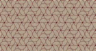
If you are maintaining a travel diary, opt for light colours in your choices of texture design download.
What are the colours that we are going to associate with travel? Let’s take for example the beach – blue of the seas, yellowish to whitish colours of the sand, a clear sky, a properly sunlit morning. The textured design can be associated with lighter shades of pink, yellow or blue to go with. Also, opt for using an ink pen to write down your journal to match with the texture and the photographs. Or to apply contrast you can take the opposite route and use the darkest shades possible. Then keep a white marker ready with you to pen down your memories.
The darkest shades will make your photographs stand out. If the creative decision is to opt for the darker shades, it is important to stick to a rather plain texture of darker shades. In lighter shades, intricate designs, flowery patterns will look good but in darker shades such designs will take the attention away from the content (the journal and the photographs) to the selected texture.
On graduation day, go for a trendy texture design download

If it is not a personal account but a shared journey with friends, partners in crime and crushes, then make it trendy. Use a lot of sketch pens, coloured glue to stick notes, phone numbers, and new addresses. Allot a different space for photographs and use a lot of red, yellow and green hues around the journal. Give it a shape that goes well with everyone.
The scrapbook should be a reflection of all those who would be using the same and writing their valuable comments on the same. Connect the string of friends you would pass it across via this scrapbook. A lot of trendy textures are available for download. So choose wisely. Sometimes you might want to keep it a little more mature. Then perhaps a plain simple texture will also work. Keep the content clean then. Do not then use many embellishments and keep it simple with the same pen and the same ink.
Did you download the latest texture design?
You can also make a quirky choice by sorting the results by the latest offerings in the market and grabbing the newest offer to keep it completely new and original. Best of luck on your texture design download. That’s all it matters to create a well-designed scrapbook.
You can buy texture design download paper on the digitalpaper.shop website.
Share this post
- Tags: crafting, creative, ideas, patterns, scrapbook-ideas, shapes, texture-design